
Many years ago I was forced to take an Economics Statistics course at McGill University in Montreal. It was a requirement for my Economics Major and one of the most miserably tough math classes I’d ever encountered.
The class was taught by an older gentleman who was maybe 150 or maybe 160 years of age. He had tenure, he immediately informed us so there was no one we could complain to when he would fail over half the class at the midterm (which he in fact, did).
I worked my behind off to scratch out a B- and was relieved to be through it. (There were some people in the class on their third try to pass.)
To my surprise over the years, the class turned out to be as valuable as it was tough. There were many aspects of the class that would come back to pay dividends. When Monte Carlo simulation software became popular in Project Management circles, I found that I had a fundamental grasp of the subject that others struggled with. When Six-Sigma became the rage, I was actually able to describe what the term meant and understand how important it could be. Yes, these are all useful but the most important thing I took away from Statistics for Economics back in the 1980s was the power of display.
Consider the following two representations of the same data:

Your eye is obviously drawn to the much more graphical pie chart. Your brain can absorb the problem, see it in context and you are even called to action. (Don’t you want to ask “What does unexplained time mean?” or “Please explain the unexplained time to me.” or, “Go figure out what is in that block of unexplained time!”)
If you wanted to draw attention to all the time your personnel are spending that has no explanation, then mission accomplished.
If however, you had bunches of unexplained time you were working on and didn’t want your project meeting bogged down in trying to explain it before you could figure it out yourself and wanted to redirect your project team meeting to more important items, then the first grid would be your friend. The “unexplained time’ would still be there. The data is the same, but the display is dramatically different.
The same can be said for almost any aspect of project data. Imagine for example, that I display a budget vs. actual report on a project in progress like this:
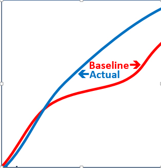
The VP of Finance doesn’t need to see more than this. “Cancel this project immediately!” is likely to be their comment. After all, look at it! The project clearly has problems. The actuals costs are way over the budgeted costs for the project to date seem out of control.
But wait.
Let’s put in my projections for where the project is expected to finish:

The project is running faster than projected and not over budget but under! Now the VP of finance is all kinds of smiles. Things are wonderful. This is the best project ever.
The difference? The power of display.
So, as a project manager you may be feeling from time to time that you are unable to get much traction. You have no authority. You can’t “make” people do what you want. “You have no title that lets you control what other managers do with their time. Despite having no authority you’re still very much responsible and even accountable; held to account for the success or failure of the project.
You may feel that you have very little power but in fact, just this one thing; this power of display, can move mountains. Sponsors, executives and many other managers can be incentivized to do the things the project needs if they can just see them in a perspective that shows the very challenge your are trying to overcome.
Mark Twain once said “There are three kinds of lies: lies, damned lies, and statistics” and there’s a lot of truth to that statement but more important than the actual analysis that I learned about all those years ago in college is how you present your findings once they’ve been calculated.
The power of display is a tool that you shouldn’t forget about in your project manager’s arsenal!


